Loading…

Three Human-Creativity Takeaways from the Sports Design Awards
The first Sports Design Awards class shows where people, not tools, made the difference: borrowed culture, systems built for a run, heritage as raw material.
By Sasha Kaye-Walsh
Drafted with AI assistance, edited by Sasha Kaye-Walsh
7/10/2026
Creative Calls AI Tools Can't Make
The first class of GDUSA Sports Design Awards winners is out, and the work at the top of the podium shares a habit. In a year when any studio could generate a competent jersey mockup before lunch, the winning teams spent their effort somewhere else: on judgment. Which cultural reference to borrow. When to hold a system loose. Here are three takeaways from the inaugural winners, drawn from winning work.
1. The strongest ideas started outside sports
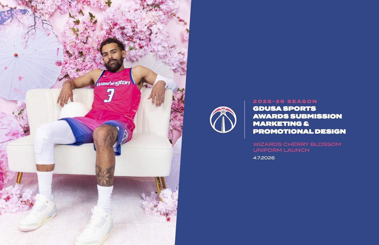
The overall runner-up did not look at other basketball uniforms. The Wizards Cherry Blossom Uniform Launch by Monumental Sports and Entertainment, a collaboration with Nike and the NBA, drew its retro-modern look from vintage Japanese postcards and timed the launch to Washington's famed peak bloom. The reference is specific and it is local. A rival club cannot borrow it without looking like a tourist.
Estudio Interlínea reached for the domino table. Cangrejeras de Santurce Dominoes honors Puerto Rican basketball fandom with a custom domino box that disassembles into four playing trays, turning team loyalty into something families actually sit down and play. And COMMUNION's FC Como Women identity, created for Mercury 13, walks away from traditional football aesthetics entirely and heads toward fashion and style culture instead. It took overall third place. The bet underneath it is bigger than a badge: that a women's club can become a cultural reference point rather than a merch table, and that the visual identity is where that starts. Three winners, three source cultures, none of them found in a sports-branding mood board.
2. The design systems kept pace with the playoffs
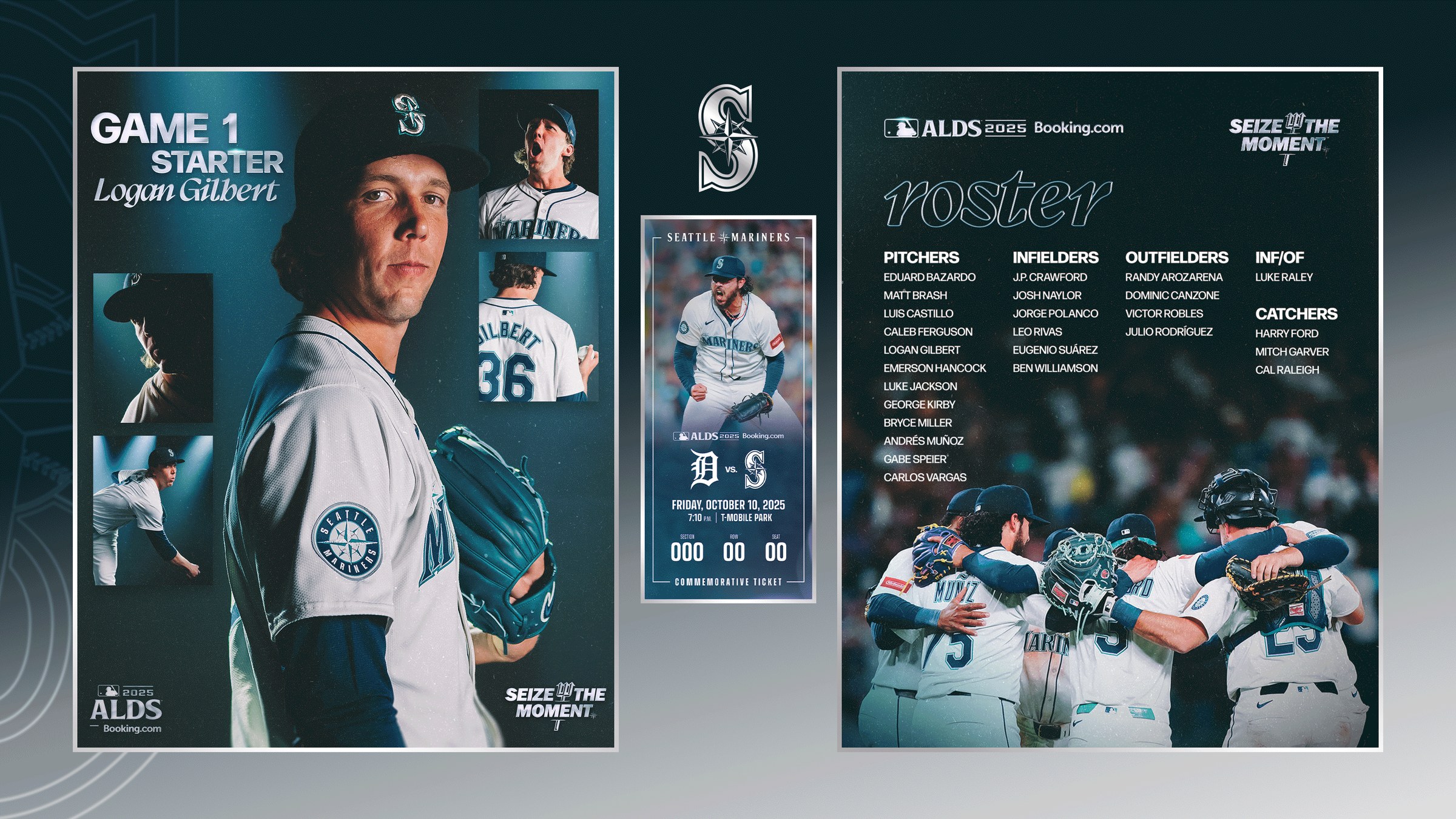
Playoff design has a clock on it. The Seattle Mariners 2025 Postseason style guide, a category winner, answers with a modular visual system built on a flexible grid. It reads as one brand from the stadium signage to the social feeds, yet it stays loose enough to keep up as a series moves. That balance is easy to praise and hard to draw.
The Gotham FC 2025 NWSL Playoffs Campaign went further and made the system itself tell the story: an orange gradient that intensified as the club advanced through the elimination rounds. The design decision is also an editorial one. Somebody had to decide the brand should rise with the team.
3. Heritage was treated as material, not nostalgia
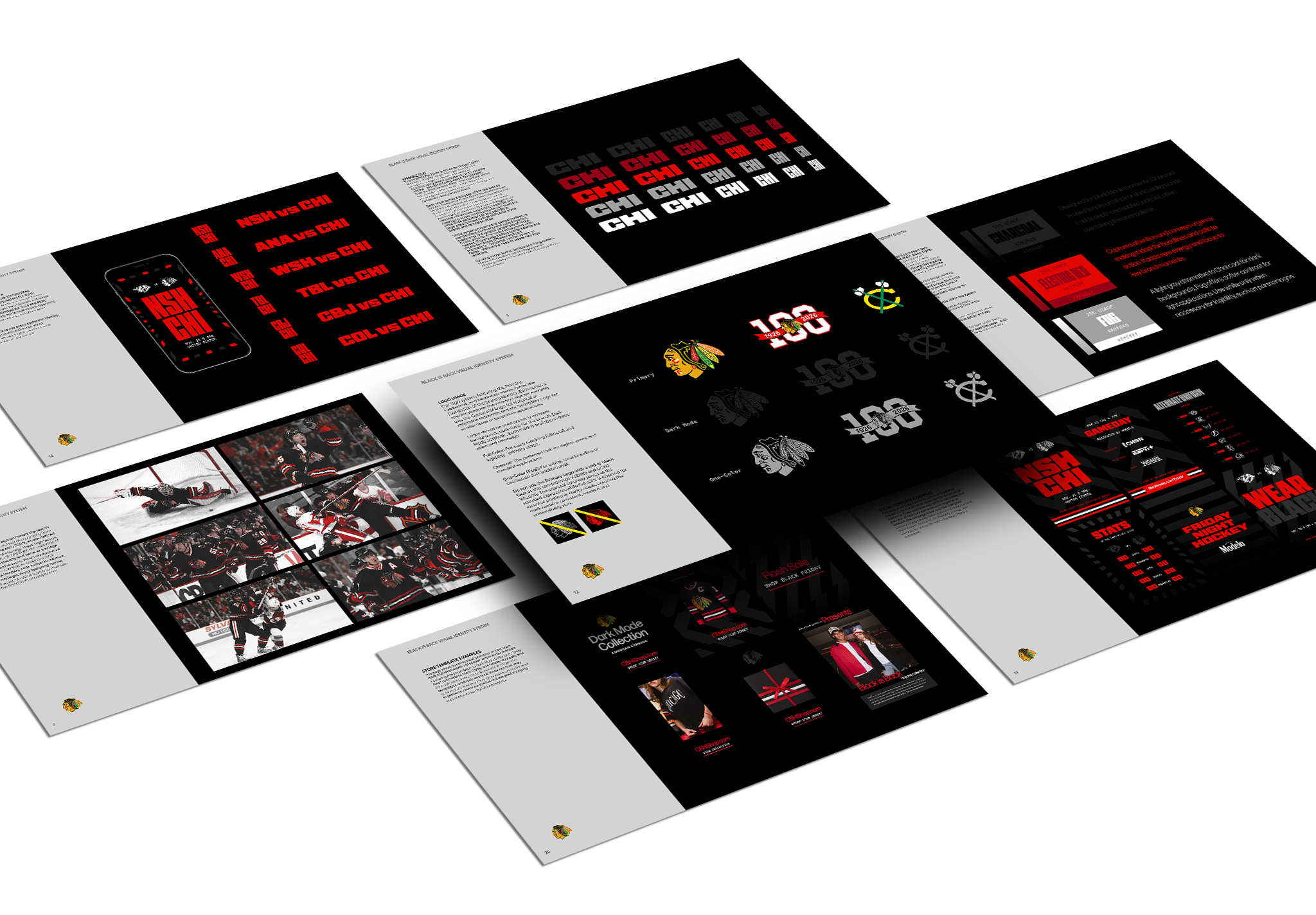
The overall winner, the Blackhawks Black Jersey Creative Identity by the Chicago Blackhawks' own team, rebuilt the jersey launch as a cohesive identity system aimed at younger fans and longtime supporters at once. That dual audience is the hard part. Novelty alone alienates one side. Reverence alone bores the other. The campaign's cultural framing threaded both, and the judges put it first overall.
Multistudio faced the same problem at architectural scale. Its renovation graphics for the University of Kansas Allen Fieldhouse, a category winner, use environmental graphics and spatial storytelling to modernize one of college basketball's most storied venues without sanding off what makes it feel like Allen Fieldhouse.
The pattern across all three: the tools handled the production, and the people made the calls. See the full class in the Sports Design Awards gallery. Got design work that made a crowd look twice? Enter the next GDUSA awards.
Cite this page
Sasha Kaye-Walsh. (2026). Three Human-Creativity Takeaways from the Sports Design Awards. GDUSA Design Gallery. https://gallery.gdusa.com/trends/three-human-creativity-takeaways-sports-design-awards
The GDUSA Newsletter