Loading…
Own this work
ShareCite this page
Freaner Creative. (2025). Freaner Creative Design Museum Logo Design. GDUSA Gallery. https://gallery.gdusa.com/project/freaner-creative-design-museum-logo-design
Design briefing
An AI-assisted expert read. Included with Pro ($19/mo).
American Graphic Design Awards Winner
American Graphic Design Awards 2025
Freaner Creative Design Museum Logo Design
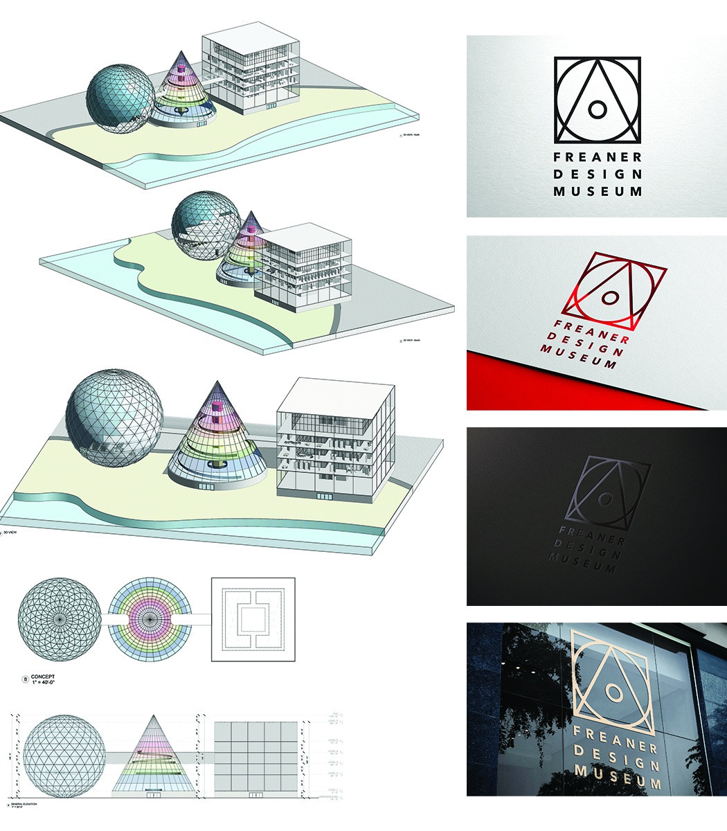
The Freaner Museum logo merges geometric simplicity with design philosophy to celebrate the art and design connection.
In the entrant's words
The Freaner Museum logo is a thoughtful representation that draws from the principles outlined in influential design texts such as "The ABCs of Triangle, Square, Circle: The Bauhaus and Design Theory" by Ellen Lupton and J. Abbot Miller, and Bruno Munari's engaging exploration of shapes in "Circle, Square, Triangle." These works delve deeply into the cultural and historical significance of basic geometric forms, illustrating how the triangle, square, and circle embody core values of simplicity and clarity in design. By utilizing these fundamental shapes, the logo not only pays homage to Bauhaus principles, which championed functionality and minimalist aesthetics, but also reflects the museum's mission to foster an appreciation for the relationship between art and design. Moreover, the logo's design resonates with Wassily Kandinsky's groundbreaking theory of Point to Line to Plane, which emphasizes the evolution of visual expression from the most basic elements to more complex arrangements. This theory aligns perfectly with the museum's approach to art, inviting viewers to perceive the seamless connection between foundational shapes and their multifaceted interpretations in various artistic contexts. By integrating this philosophical approach, the logo becomes more than just a visual identifier; it transforms into a narrative that encourages exploration and invites audiences to contemplate the depth and significance of the artistic journey. The architectural rendering of the museum's façade is a reference to how elegantly it echoes the logo's geometric shapes, further reinforcing the connection between the building's design and the emblem that represents it. By incorporating similar forms and visual language, the rendering not only highlights the museum's modern aesthetic but also serves as a physical manifestation of the principles encapsulated in the logo. This synergy between the architecture and the logo creates a cohesive experience for visitors, inviting them to appreciate the harmony between structure and design while reflecting the museum's mission of celebrating visual culture.


