Loading…

American Graphic Design Awards 2025
Town of Upland (IN) Logo Design
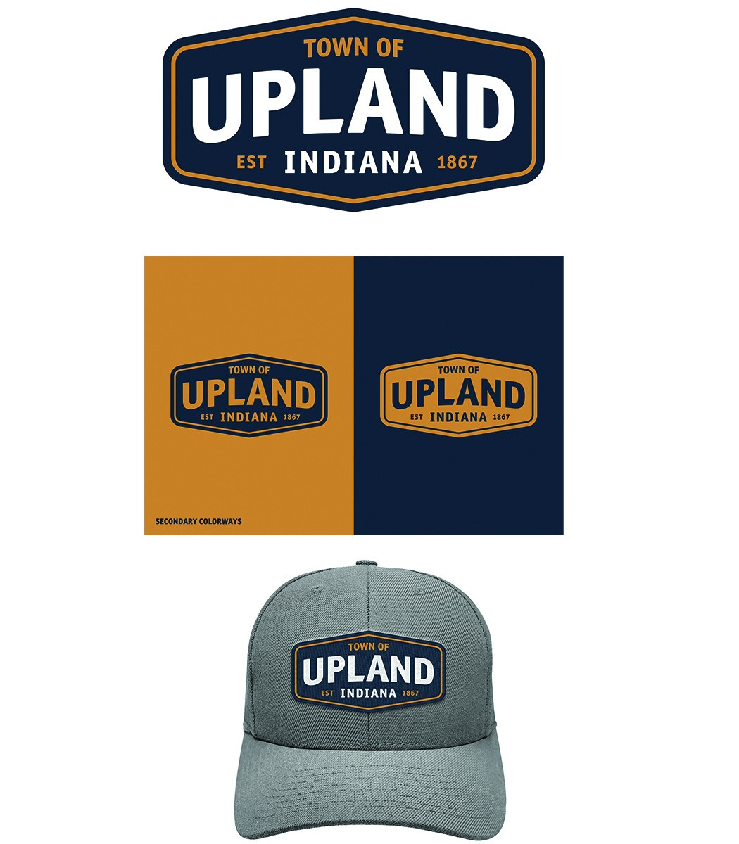
“The Town of Upland logo is built on an emblematic hexagon form inspired by vintage train signage, a nod to the town’s history as a railroad stop.”
Creative Credits
Creative DirectorRyan James
In the entrant's words
The Town of Upland logo is built on an emblematic hexagon form inspired by vintage train signage, a nod to the town’s history as a railroad stop. The word Upland rises slightly across the mark, a subtle gesture toward the town’s name and its ongoing growth. The color palette, drawn from Indiana’s state flag, pairs deep navy with warm gold to convey pride, stability, and optimism. The design includes references to regional history, local symbols, and economic development goals, creating a mark that resonates with residents, current businesses, and those looking to invest in the community. Together, these elements create an identity that honors Upland’s heritage while embracing its forward-thinking spirit.
From the original award submission.
Own this work
ShareCite this page
Ryan James. (2025). Town of Upland (IN) Logo Design. GDUSA Design Gallery. https://gallery.gdusa.com/project/town-of-upland-in-logo-design
Design Briefing
A designer’s read of this work and what to borrow from it. Included with Pro ($19/mo).