Loading…

American Graphic Design Awards WinnerFull Page
American Graphic Design Awards 2025
TeddyTech Logo & Visual Identity Design
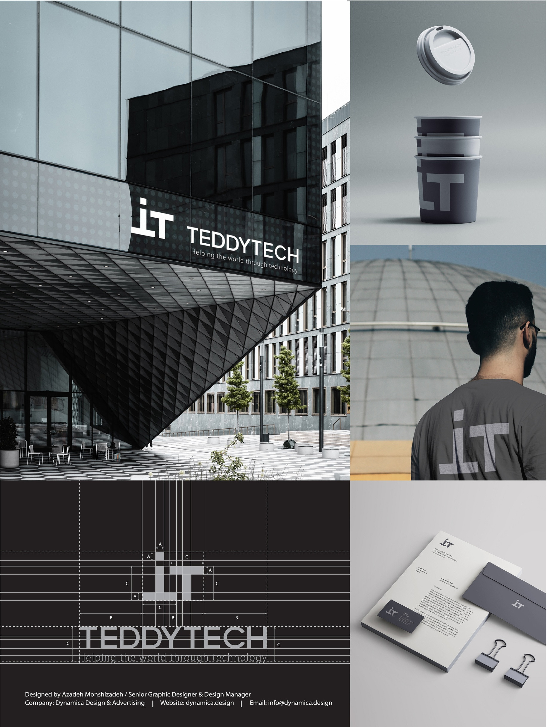
TeddyTech’s logo and visual identity blend precision and trust to empower digital security solutions.
Creative Credits
DesignerAzadeh Monshizadeh
WriterKamran Zarrinkamar
In the entrant's words
TeddyTech – Brand Strategy Overview 1. Brand Core Industry: IT Security Solutions Location: Vancouver, Canada Founder: Lucian Purpose: Making the digital world safer and smarter through innovative security solutions. Vision: To be a trusted leader in cybersecurity by protecting what matters most people, data, and digital integrity. Mission: Providing intelligent, reliable, and adaptive IT security that enables users to operate confidently in a connected world. Core Values: • Trust: The foundation of real security. • Innovation: Smart, forward-thinking solutions. • Precision: Attention to detail in every step. • Stability: Reliability and long-term protection. • Simplicity: Clear, structured, and efficient. 2. Brand Personality TeddyTech is precise, trustworthy, and future-oriented, with a minimalist character. Its communication style is professional, confident, and intelligent, focusing on clarity and trust. Tone of Voice: • Confident yet approachable • Technical yet human • Direct, concise, and calm 3. Visual Identity System Logo Concept: Two T letters (from Teddy and Tech) are merged to form a geometric square a symbol of stability, protection, and IT essence. Clean, sharp lines reflect precision and order, while maintaining high adaptability across all sizes. Color Palette: • Dark Gray (#2C2C2C): Strength, professionalism • Light Gray (#E5E5E5): Clarity, balance Together, they express security and neutrality. Typography: A modern geometric sans-serif font such as Inter or Helvetica Neue, highlighting clarity and structure. Layout System: Grid-based composition ensures discipline and visual harmony, supported by generous white space for a minimalist look. 4. Brand Applications Stationery: Business cards and letterheads follow a minimalist grid. Contrast between light and dark tones conveys transparency and strength. Digital Presence: Online layouts are clean, balanced, and intelligent, using neutral backgrounds and modern imagery to reflect professionalism. 5. Brand Tagline Helping the world through technology A clear and universal statement that embodies TeddyTech’s mission to protect and empower through technology. 6. Brand Keywords Cybersecurity, Protection, Intelligence, Stability, Trust, Precision, Smart Solutions 7. Brand Summary TeddyTech represents the balance between intelligence and simplicity. Every element from logo to layout is crafted to inspire trust, precision, and stability. In a world defined by digital security, TeddyTech stands as a smart, reliable, and future-driven brand. Credits: Designer: Azadeh Monshizadeh Prepared by: Dynamica Design and Advertising Client: Lucian
From the original award submission.
Own this work
ShareCite this page
Dynamica Design and Advertising. (2025). TeddyTech Logo & Visual Identity Design. GDUSA Design Gallery. https://gallery.gdusa.com/project/teddytech-logo-and-visual-identity-design
Design briefing
An AI-assisted expert read. Included with Pro ($19/mo).