Loading…

American Graphic Design Awards Winner
American Graphic Design Awards 2025
Studio Litho/Litho Branding
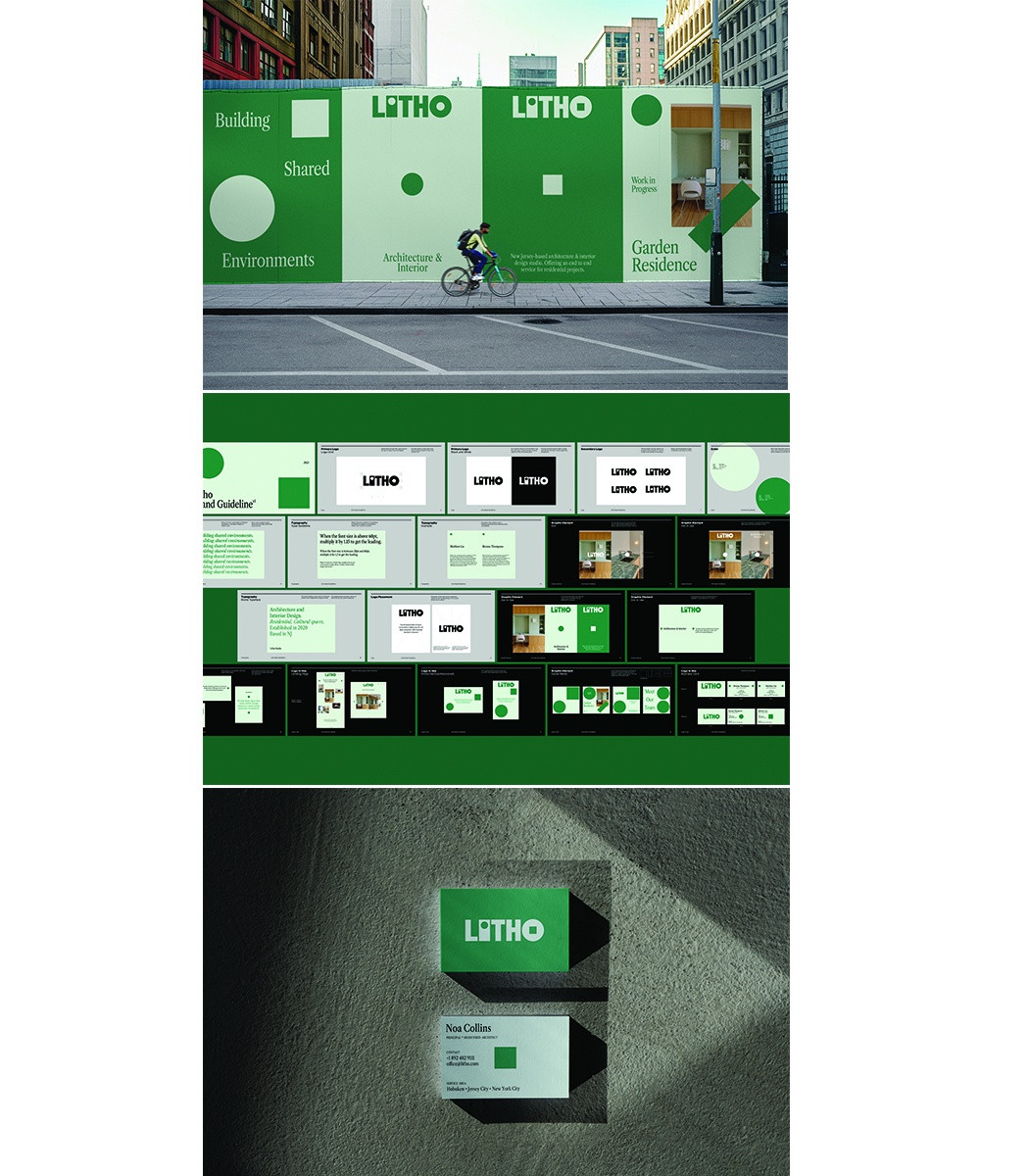
Litho's branding captures the essence of collaboration through dynamic design elements and a dialogue-inspired identity.
Firm
Office of FieldsCategory
Branding + Identity ProgramsCreative Credits
Creative DirectorHaejung Choi
DesignerHaejung Choi
In the entrant's words
Branding for Litho, an architecture and interior design studio. The identity draws inspiration from the studio’s two principals, whose partnership forms the foundation of the concept. The design explores a dichotomy—two elements that play off each other through contrast and similarity. Two dots are embedded in the logotype, transforming and echoing one another through shapeshifting forms. In application, the paired dots act as visual quotation marks, highlighting key content, guiding attention, and reinforcing the identity system. They also suggest a dialogue between two people—a metaphor for creative collaboration. The motion design further extends this idea: the dots transform into different shapes and move in conversation, embodying the evolving dialogue between the two founders and their creative process.
From the original award submission.
Own this work
ShareCite this page
Office of Fields. (2025). Studio Litho/Litho Branding. GDUSA Design Gallery. https://gallery.gdusa.com/project/studio-litho-litho-branding
Design briefing
An AI-assisted expert read. Included with Pro ($19/mo).