Loading…
Own this work
ShareCite this page
Purrsnickitty Design. (2025). Press + Pour Branding. GDUSA Gallery. https://gallery.gdusa.com/project/press-pour-branding
Design briefing
An AI-assisted expert read. Included with Pro ($19/mo).
American Graphic Design Awards Winner
American Graphic Design Awards 2025
Press + Pour Branding
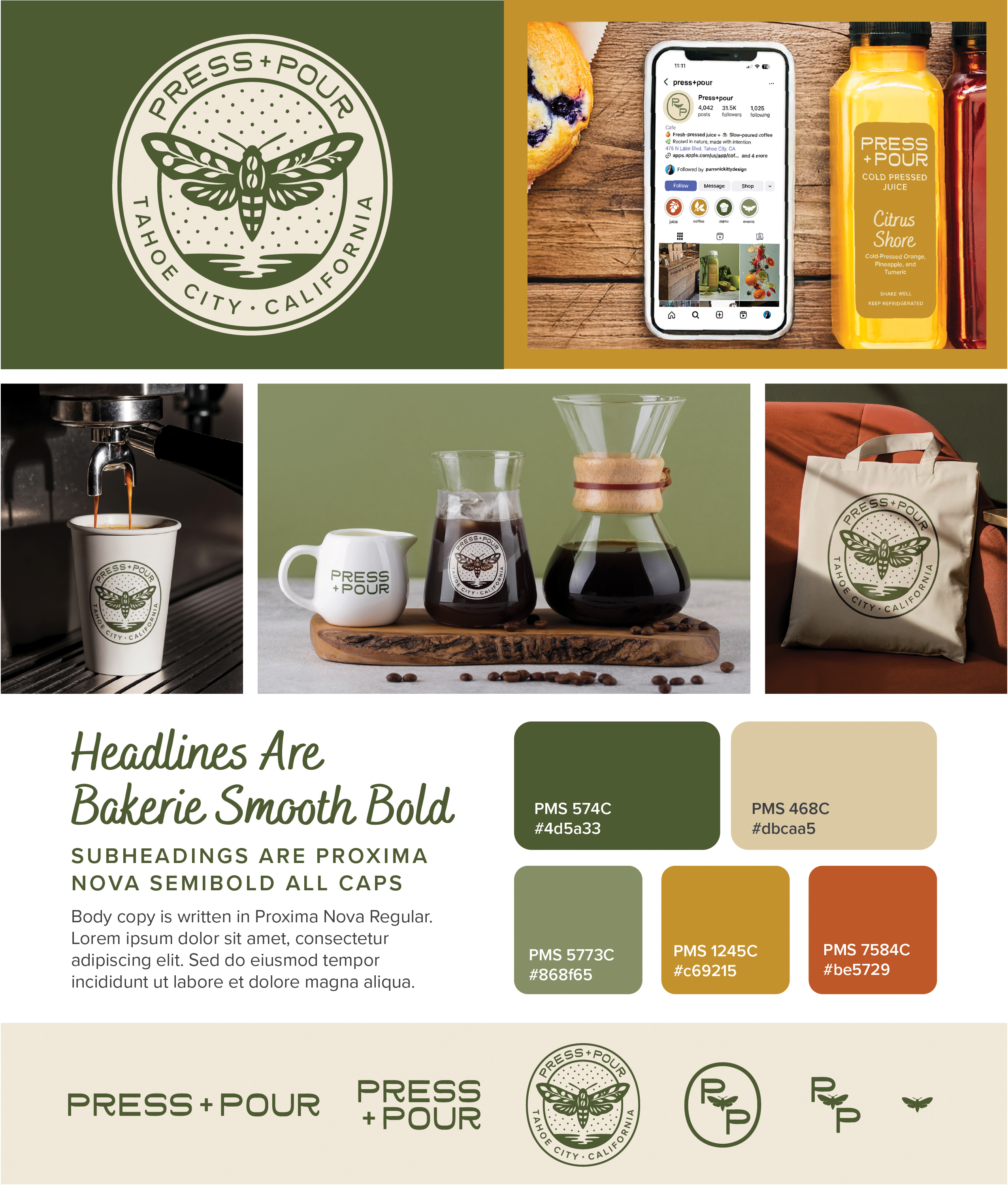
Press + Pour's branding harmonizes nature and creativity, inviting customers into a vibrant, balanced café experience.
In the entrant's words
At Press + Pour, freshness lives in every detail — in the ingredients, the energy, and the design. Our identity was built around the idea of balance: coffee and juice, light and dark, calm and vibrant. The hummingbird moth became our emblem for that duality — a quiet symbol of transformation, creativity in motion, and connection to nature. Drawn to light and rooted in care, it represents how we move through the world: with intention, warmth, and a touch of wonder. Earthy hues, organic symmetry, and handcrafted textures come together to create a brand that feels grounded yet alive — a reflection of a space where creativity flows and every moment feels freshly poured. The brand began with strategy — uncovering the core values of fresh energy, creative craft, and everyday connection. Through discovery workshops and archetype alignment, we defined the café’s personality as a blend of the Creator’s artistry, the Caregiver’s thoughtfulness, and the Everyman’s approachable spirit. That foundation guided every design decision. The visual identity translates these traits into form and feeling, anchored by the hand-drawn hummingbird moth — a symbol of balance, transformation, and creative movement. Deliverables included a full responsive logo suite, typography system, and color palette inspired by the natural hues of Lake Tahoe — soft greens, sun-warmed golds, and neutrals that evoke both calm and vitality. Supporting assets such as packaging concepts, environmental applications, and brand collateral extend the story through intentional details and tactile warmth. Every element was designed to feel thoughtful, inviting, and full of life — a brand where design, craft, and community move together in harmony.


