Loading…
Own this work
ShareCite this page
Freaner Creative. (2025). Naval Base Point Loma Logo Design. GDUSA Gallery. https://gallery.gdusa.com/project/naval-base-point-loma-logo-design-2025
Design briefing
An AI-assisted expert read. Included with Pro ($19/mo).
American Graphic Design Awards Winner
American Graphic Design Awards 2025
Naval Base Point Loma Logo Design
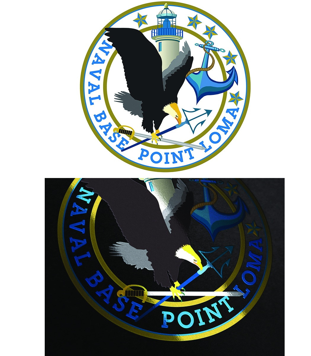
The Naval Base Point Loma logo blends heritage and strength through iconic symbols of California and the Navy.
In the entrant's words
The Naval Base Point Loma logo is a striking emblem that combines various elements symbolizing strength, pride, and the facility's maritime heritage. At the center of the logo is a classic California state outline filled with a vibrant gold-yellow hue, representing the state's rich history and connection to the sea. Five stars encircle this outline, symbolizing excellence and the achievements of the base. These stars are arranged in a semicircle at the top of the logo, adding a sense of unity and honor. The majestic California eagle, depicted in mid-flight with its broad wings, is featured alongside the state outline. This powerful bird, with its striking brown feathers and a contrasting white head, symbolizes strength, freedom, and the spirit of California. Its keen eyes, fixed on the horizon, reflect determination and vigilance, while its sharp talons represent protection and leadership. Together, the eagle and the outline of the state create a powerful emblem of California's heritage and aspirations. The design features an anchor, a timeless symbol of the Navy's strength and steadfastness. It is illustrated in a deep blue color that complements the gold and yellowish tones. The anchor is intertwined with a proud sword, a Marine holds, symbolizing bravery and the commitment to serve and protect. The sword is positioned diagonally, adding a dynamic element to the logo. Another key aspect of this emblem is that it incorporates the iconic Point Loma Lighthouse, which represents guidance and safety. The lighthouse is depicted towards the base of the logo, rendered intricately in blue to maintain the cohesive color scheme. The design is completed by a trident placed at the center of the logo. The trident symbolizes naval power and maritime heritage, echoing the Navy's strong ties to the sea and creating a powerful visual representation of its mission. All these elements come together in a circle, conveying unity and wholeness, reinforcing the idea that Naval Base Point Loma is a hub of strength and community. The overall blue and gold, with a hint of yellow, color palette emphasizes the pride and bravery associated with the Marines and the Navy, while providing a visually appealing and meaningful emblem that embodies the spirit of Point Loma.


