Loading…
Own this work
ShareCite this page
Freaner Creative. (2025). Freaner Creative 40 Years Logo Design. GDUSA Gallery. https://gallery.gdusa.com/project/freaner-creative-40-years-logo-design
Design briefing
An AI-assisted expert read. Included with Pro ($19/mo).
American Graphic Design Awards Winner
American Graphic Design Awards 2025
Freaner Creative 40 Years Logo Design
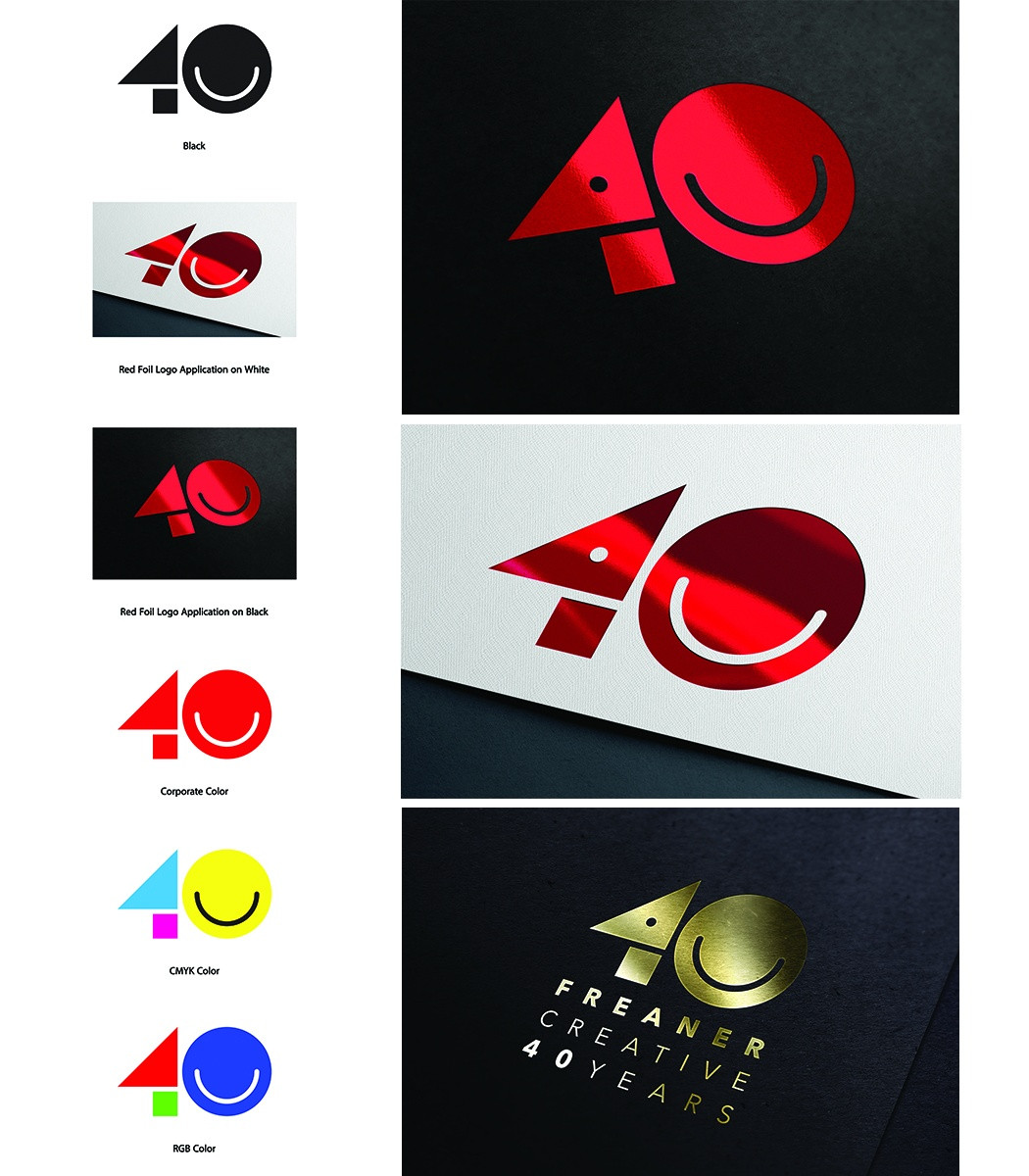
Freaner's 40th anniversary logo blends modern design with geometric forms, celebrating creativity and the firm's legacy.
In the entrant's words
The Freaner 40th anniversary logo is a striking embodiment of modern design principles, skillfully integrating a point, line, and plane along with the three fundamental shapes: square, triangle, and circle. This logo creatively forms the number 40, symbolizing four decades of innovation and excellence at Freaner Creative, a renowned design firm based in San Diego. The design draws inspiration from Wassily Kandinsky's theories, particularly his exploration of geometric forms and their expressive potential, as well as his concept of "Point and Line to Plane." The combination of shapes not only celebrates the numeric milestone but also reflects Kandinsky's belief in the intrinsic connection between visual art and emotional experience. At its core, the logo encapsulates a journey through the creative process, with the point serving as a foundational element that signifies the inception of ideas. Lines extend from this point, seamlessly integrating the other shapes, where squares and triangles converge to create a dynamic form that captures movement and growth. The circular elements embrace this structured chaos, symbolizing unity and continuity. The curved line within the circle resembles a smile, imbuing the logo with feelings of happiness and optimism. This playful element not only enhances the overall aesthetic but also forges a connection to the modern design landscape, reminiscent of familiar emoji styles. By incorporating such a dynamic feature, the logo feels current and aligns with today's design trends, reflecting a sense of warmth and approachability that resonates with viewers. This thoughtful integration of joyful elements contributes to a more engaging visual identity, effectively capturing the essence of positivity and contemporary relevance. Moreover, the influence of Bauhaus design philosophies is evident in the logo's simplicity and function. It marries aesthetic appeal with conceptual depth, embodying the core values of Freaner Creative and its commitment to pushing the boundaries of design for 40 years. Starting with a simple black logo is a widely used and strategic method in logo design. By initially working in black and white, you can concentrate on the essential elements of the logo, including its shape, form, structure, and readability. If the design functions effectively in a monochrome format, it indicates that the core design is solid and will likely be adaptable to various colors and backgrounds in the future. The Freaner 40th anniversary logo will feature a bold and vibrant red, capturing the spirit of creativity and celebrating the diverse range of visual design in both traditional and digital formats. Additionally, we will incorporate CMYK and RGB color schemes to pay tribute to various techniques, showcasing how the logo symbolizes a seamless integration of all visual art forms and the spectrum of visual design across both traditional and digital mediums. By integrating these color formats, the logo represents the harmonious blend of all forms of visual art. This intentional choice signifies Freaner Creative's versatility and commitment to embracing a wide array of design techniques, honoring the past while confidently stepping into the future. The use of one color not only simplifies the visual identity but also reinforces the idea that effective design transcends mediums and styles, unifying the diverse creative processes that have defined the company over the past 40 years. In summary, the Freaner 40th anniversary logo serves as more than just a commemoration of the past; it reflects the firm's deep roots in modern design and how essential elements can converge to create something truly significant and inspiring.


