Loading…
Own this work
ShareCite this page
AgenCe Design Co. (Celano Design Studio Inhouse Branding). (2025). Levant Branding. GDUSA Gallery. https://gallery.gdusa.com/project/levant-branding
Design briefing
An AI-assisted expert read. Included with Pro ($19/mo).
American Graphic Design Awards Winner
American Graphic Design Awards 2025
Levant Branding
Levant's branding harmonizes Mediterranean inspiration with modern elegance, creating a distinctive culinary identity.
In the entrant's words
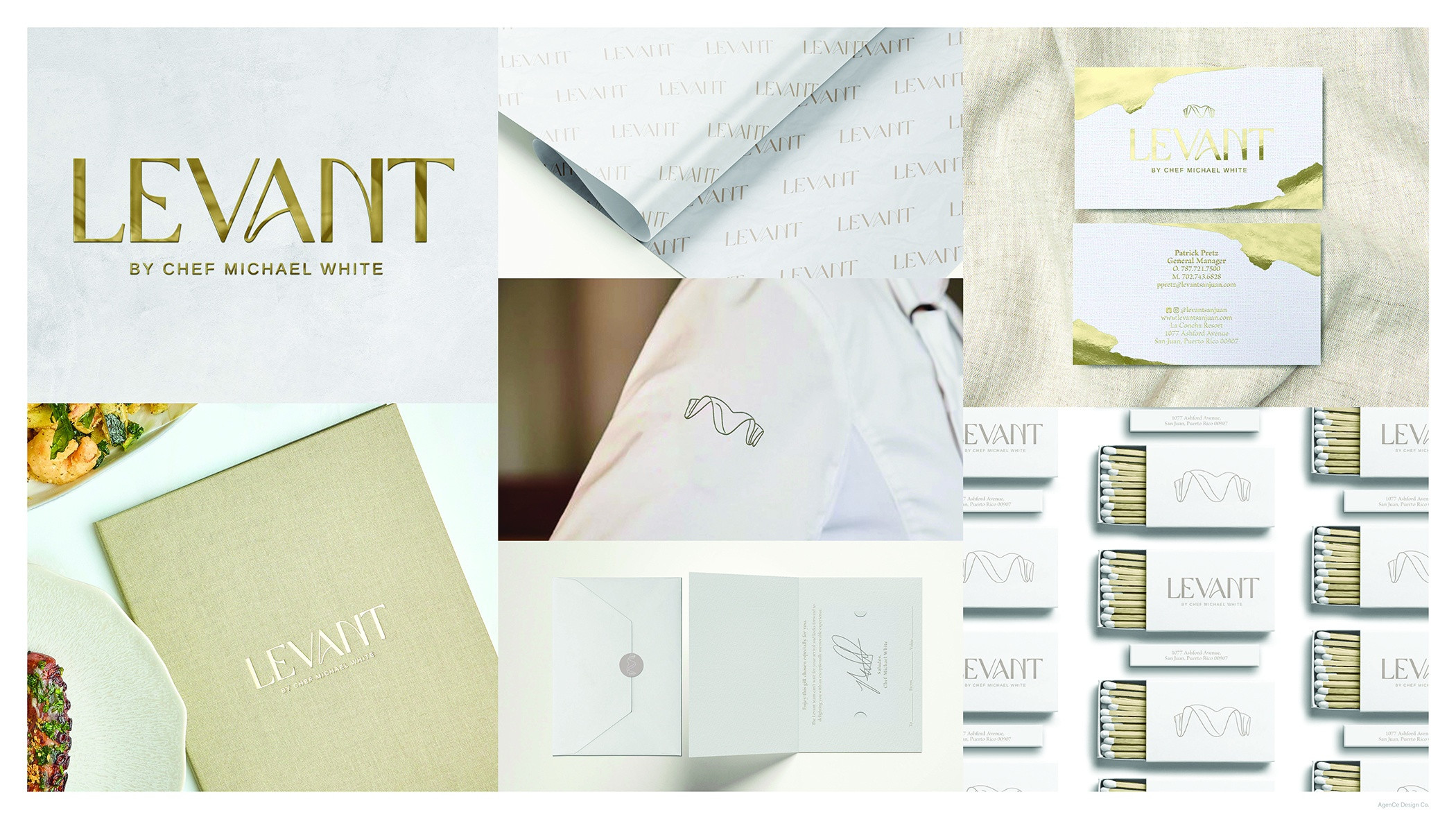
Located in San Juan, Puerto Rico, Levant is set on the majestic Caribbean Sea, overlooking the shimmering water. Surrounded by the oscillating ridges of the giant clamshell walls and rippling blue reflection of the sun and waves, Levant’s food and aesthetic are perfectly matched. From the eddies, currents, and gyres that undulate and flow within and throughout the Mediterranean, the name Levant came to life. Our brand colors draw inspiration from the diverse Mediterranean landscapes. We incorporate a palette of sandy hues evoking the rugged beauty of the islands where rich gold accents reflect the opulence of Levant. Darker beige and gray tones accent colors that pay homage to the distinctive colors of the coastal rocks, sun bleached coral, and shells found along the Mediterranean shores. Our brand font palette encompasses a blend of serif and sans-serif typefaces. The primary font for headlines is Playfair Display – an elegant typeface that exudes sophistication and modernity. It is strategically employed in headers and crucial touchpoints to present vital information in a clear, concise, and legible manner. To complement this, we integrate Freight Sans Pro, a versatile sans-serif font with a clean and inviting appearance. Its simplicity and warm appeal make it ideal for body copy and subheadings, ensuring a seamless and engaging reading experience. Designed thoughtfully, our custom logotype which encapsulates the rich narrative of Levant, is elegantly complemented by the Arimo Regular sans-serif typeface. Arimo conveys a sense of modernity while ensuring our subheadings remain clear and easy to read, enhancing the overall visual appeal and readability. Whether seen on signage, menu, business cards, or digital platforms, the logo remains recognizable and exudes the blend of elegance and sophistication that defines Levant.


