Loading…

American Inhouse Design Awards Winner
American Inhouse Design Awards 2025
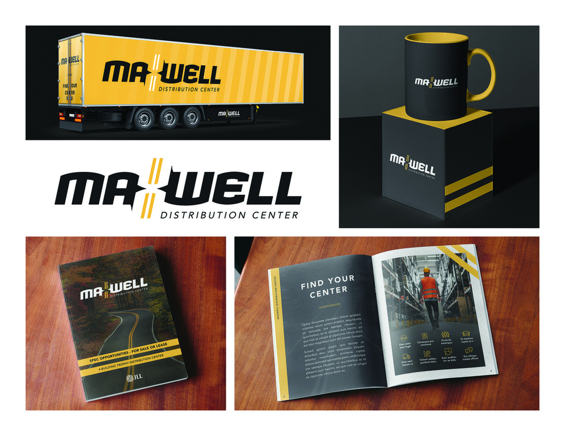
Maxwell Distribution Center Logo
A logo design for Maxwell Distribution Center cleverly uses negative space to symbolize transportation networks.
Firm
JLL CreativeCategory
Branding + Identity ProgramsCreative Credits
Creative DirectorShaina Nielson
Art DirectorRebecca Behm
DesignerJayson Meyer
MarketersSabrina Eisen
MarketersAmber Marcanio
In the entrant's words
This concept was developed for a distribution center with a specific requirement to utilize negative space in their logo. I incorporated a bold double yellow line, reminiscent of highway markings within the negative space to form the letter "X" in "Maxwell." The design creates a visual connection to transportation networks, referencing the core business. Although the project was ultimately placed on hold before final selection, the solution successfully married functional negative space with industry-relevant symbolism in a clean, memorable mark.
From the original award submission.
Own this work
ShareCite this page
JLL Creative. (2025). Maxwell Distribution Center Logo. GDUSA Design Gallery. https://gallery.gdusa.com/project/maxwell-distribution-center-logo
Design briefing
An AI-assisted expert read. Included with Pro ($19/mo).