Loading…
Five Award-Winning Package Designs that Leverage Transparency for Results
As date-label laws and recyclability mandates hit packaging, five GDUSA winners show how disclosure became a design opportunity instead of the fine print.
By GDUSA Editorial
7/13/2026
Disclosure Is the New Shelf Appeal
Packaging law is having a design year. California's new date-labeling rules take aim at the "best by" confusion that drives food waste, reported by The Dieline, while a 16-partner EU project races the 2030 recyclability mandate for flexible plastics. Even the trade-show circuit noticed: The Dieline's standouts from the Summer Fancy Food Show leaned informational, and the Sustainable Brands Conference put claims and materials at the center of the brand conversation, per PRINT.
The regulators are late. GDUSA's package-design winners have been treating the label as the message for years, and the 2025 American Graphic Design Awards class shows what it looks like when disclosure becomes the design opportunity instead of the fine print. There is a commercial logic underneath the compliance story: a shopper who no longer trusts adjectives will still trust an ingredient list, a place of origin, a date that means what it says. The designers below understood that the label is the one piece of brand real estate the customer is guaranteed to read. Five proofs from the archive.
1. Make the ingredient story the whole identity
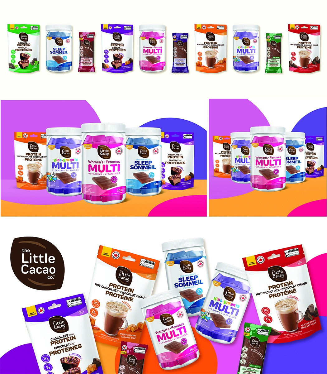
The Little Cacao Co. Packaging by Invok Brands positions a chocolate-adjacent product against the vitamin aisle, and it does so by putting the cacao bean's benefits on the front of the pack. The stated goal of the identity is transparency and trust. Nothing is buried; the argument for the product IS the packaging.
2. Lead with what is actually inside
W.S. Badger Company's Rose Beauty Line Packaging rebrand puts its organic, food-grade ingredients forward. Beauty packaging is a category built on suggestion, which is exactly why a mission-driven, family-owned company chose specification instead. The label works like a handshake.
3. Let the origin do the designing
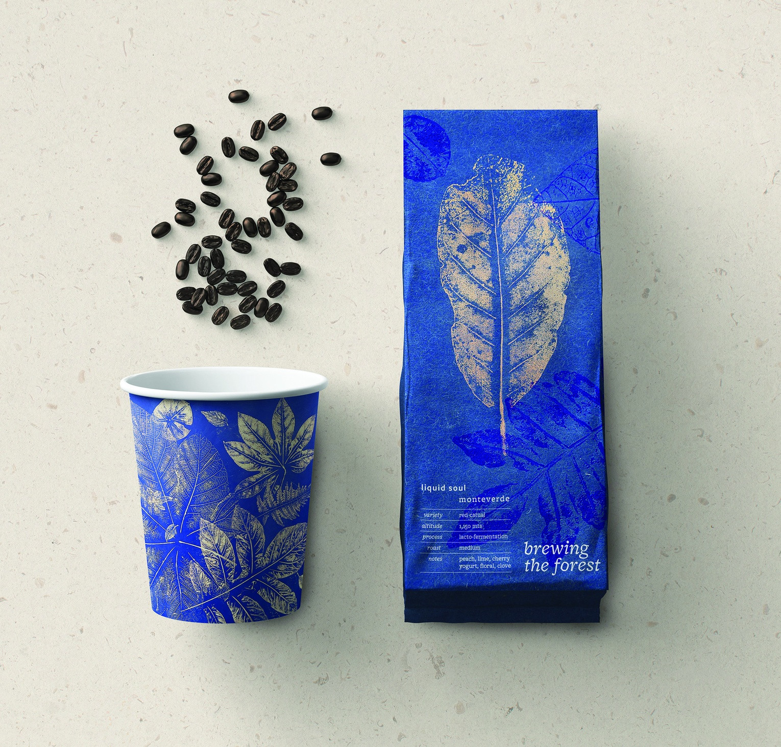
Studio Holden's Brewing the Forest, created with a Costa Rican coffee farmer and conservationist, wraps the bag in a botanical pattern monoprinted from foliage found in the Monteverde cloud forest. The place the coffee comes from is physically pressed into the packaging that sells it. No sustainability icon set could say it better.
4. Organic does not have to whisper
Wellness claims usually come in sage green. CF Napa Brand Design's Kind Earth Organic Vodka makes its organic commitment the centerpiece of a spirits label built to compete on a loud shelf, proof that a virtue claim can carry shelf presence instead of apologizing for it.
5. Say what it is in the largest type you have
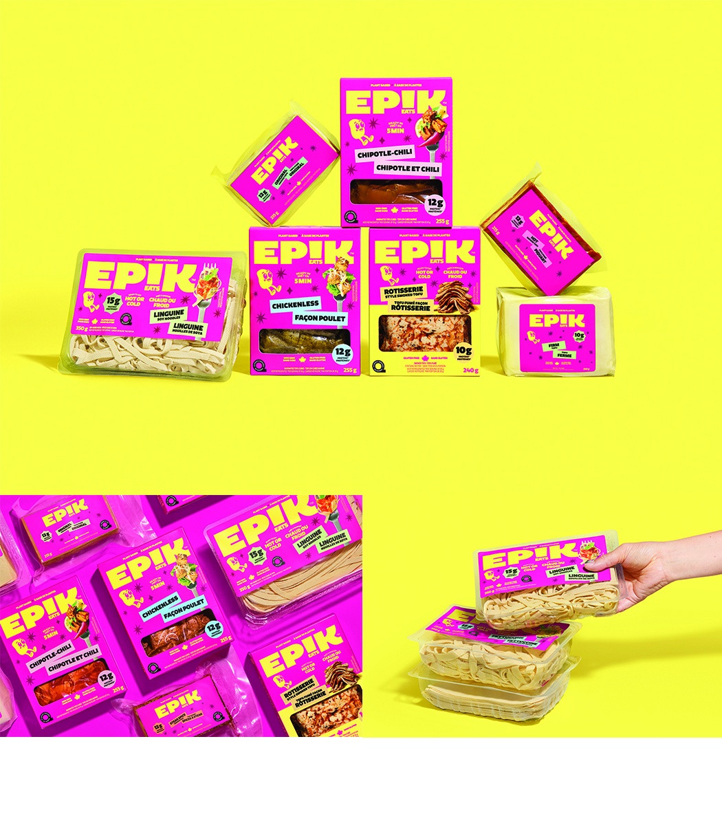
Pigeon's Epik Eats, Plant-based and Proud states its category allegiance in an oversized typographic wordmark on a striking magenta field. Plenty of plant-based brands hedge toward looking like the meat they replace. This one announces itself. That is disclosure as confidence.
Regulation will keep pushing labels toward legibility. The winners above suggest the studios that get there first will not be the ones grumbling about compliance. Browse the full package-design archive, and if your own shelf work says something true, the 2026 American Package Design Awards close Friday, July 10. Enter now.
Cite this page
GDUSA Editorial. (2026). Five Award-Winning Package Designs that Leverage Transparency for Results. GDUSA Gallery. https://gallery.gdusa.com/trends/five-packages-that-tell-the-truth-on-the-shelf
The GDUSA Digest