Loading…

American Graphic Design Awards Winner
American Graphic Design Awards 2025
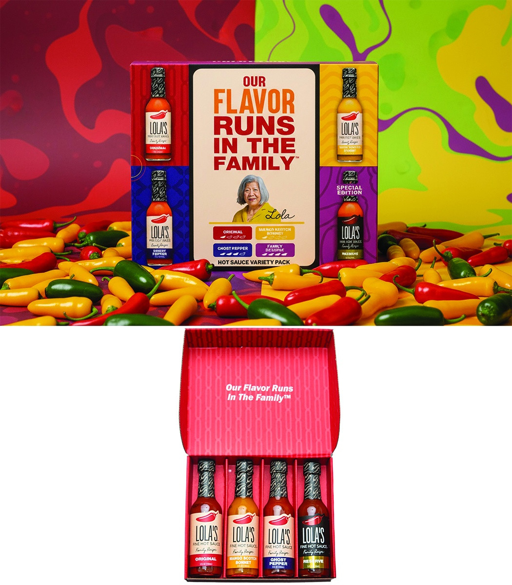
Lola's Hot Sauce Gift Pack
Lola's Hot Sauce Gift Box combines emotional storytelling with vibrant design for a standout retail and gifting experience.
Firm
PKG Brand DesignCategory
Package DesignCreative Credits
In the entrant's words
The Lola’s Hot Sauce Gift Box successfully blends brand storytelling, shopper impact, and category best practices. 1. Front Panel Hierarchy The design follows a clear communication hierarchy: - The bold headline “Our Flavor Runs in the Family” serves as the primary attention-grabber, leveraging a strong, emotional brand message. - A large, centralized image of Lola herself adds authenticity and reinforces the family-owned brand story, giving the product a face and emotional connection. - Supporting text and flavor callouts are neatly arranged in a structured grid below, ensuring clarity and quick comprehension at shelf. - The four hot sauce bottles frame the center message with strong Lola's branding. 2. Use of Color & Blocking The pack employs color blocking to differentiate each sauce flavor. Bright hues (red, yellow, purple) not only align with the heat and vibrancy of the category but also create a strong shelf block effect. The bold, contrasting background patterns amplify the energy of the brand and enhance appetite appeal. From a design strategy standpoint, this creates both eye-catching stopping power and easy flavor navigation for the shopper. 3. Brand & Product Recognition Side panels feature product bottle images. This tactic instantly communicates the variety inside the box, reducing consumer guesswork. It also highlights premium product cues—showing the actual labels reinforces brand consistency across individual SKUs and the multipack. 4. Storytelling Integration The inclusion of Lola’s portrait and signature connects the consumer directly to the founder’s story. This elevates the brand beyond functional product attributes into an authentic heritage narrative, a proven packaging strategy that builds trust and loyalty. The phrase “Flavor Runs in the Family” doubles as both a slogan and a brand promise, encapsulating generational pride and authenticity. 5. Shopper-Centric Design - Giftable Presentation: The box design positions this as a ready-made gift set through bold messaging and unified branding. - Convenience & Clarity: Flavor names and heat levels are called out directly on the front, providing quick shopability. - Premium Cues: Structured layout, bold typography, and high-quality imagery reinforce the value perception, justifying premium pricing. Summary From a packaging design perspective, Lola’s Hot Sauce Gift Box combines emotional storytelling, clear communication hierarchy, shopper-friendly flavor navigation, and bold visual blocking. The design not only sells the product but also sells the brand story of heritage, authenticity, and family pride, making it both a strong retail and gifting solution.
From the original award submission.
Own this work
ShareCite this page
PKG Brand Design. (2025). Lola's Hot Sauce Gift Pack. GDUSA Design Gallery. https://gallery.gdusa.com/project/lola-s-hot-sauce-gift-pack
Design briefing
An AI-assisted expert read. Included with Pro ($19/mo).