Loading…
Own this work
ShareCite this page
Pigeon. (2025). INSELBERG, The Mountain That Mirrors The Region. GDUSA Gallery. https://gallery.gdusa.com/project/inselberg-the-mountain-that-mirrors-the-region
Design briefing
An AI-assisted expert read. Included with Pro ($19/mo).
American Graphic Design Awards Winner
American Graphic Design Awards 2025
INSELBERG, The Mountain That Mirrors The Region
INSELBERG's design captures the essence of Mont Rougemont, creating a refined and accessible identity for Québec wine.
In the entrant's words
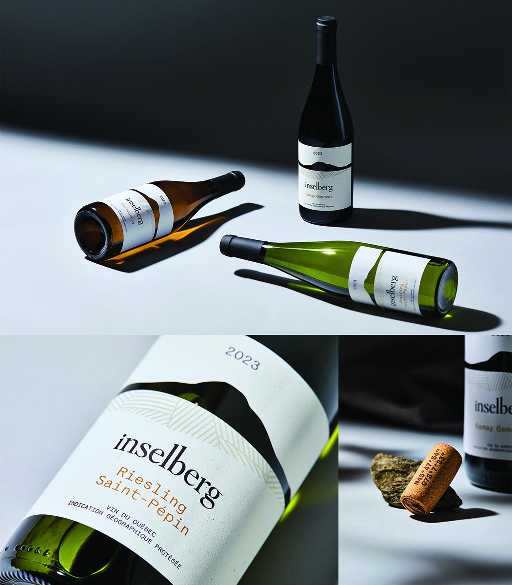
INSELBERG is a new Québec wine brand inspired by Mont Rougemont’s striking geological formation, transforming the essence of its terroir into a refined name, identity, and packaging design that connect provenance and taste through two collections: Lot 100 Dix and a premium series. The creative execution translated the strategic foundation into packaging that is refined, modern, and deeply rooted in the vineyard’s story. The silhouette of Mont Rougemont was reinterpreted as a bold emblem, while a custom die cut outlines the mountain line, creating a tactile and sculptural effect that mirrors the natural rise of the land itself. Earthy tones and clean graphic lines echo the contrasts of the terroir, supported by typography chosen for clarity and sophistication. Working hand in hand with the winemaker allowed the design team to visually express the vineyard’s geology and character, resulting in packaging that feels authentic and site-specific. The system accommodates two distinct wine series, allowing individuality while maintaining cohesion under one masterbrand. Importantly, the labels avoid appearing overly premium or pretentious, striking the right balance between refinement and accessibility to present Québec wine as both inviting and credible. On shelf, INSELBERG distinguishes itself with a refined palette and architectural label structure that create calm and cohesion in a crowded aisle. The die-cut mountain outline acts as a memorable brand marker and a powerful navigation tool, ensuring instant recognition across SKUs. Differentiation between the two series is clear yet complementary, forming a unified and elegant block with strong shelf presence. Designed with equal consideration for digital channels, the minimalist yet tactile aesthetic reinforces authenticity and distinction, avoiding pretension while amplifying impact both in-store and online.


