Loading…

American Graphic Design Awards Winner
American Graphic Design Awards 2025
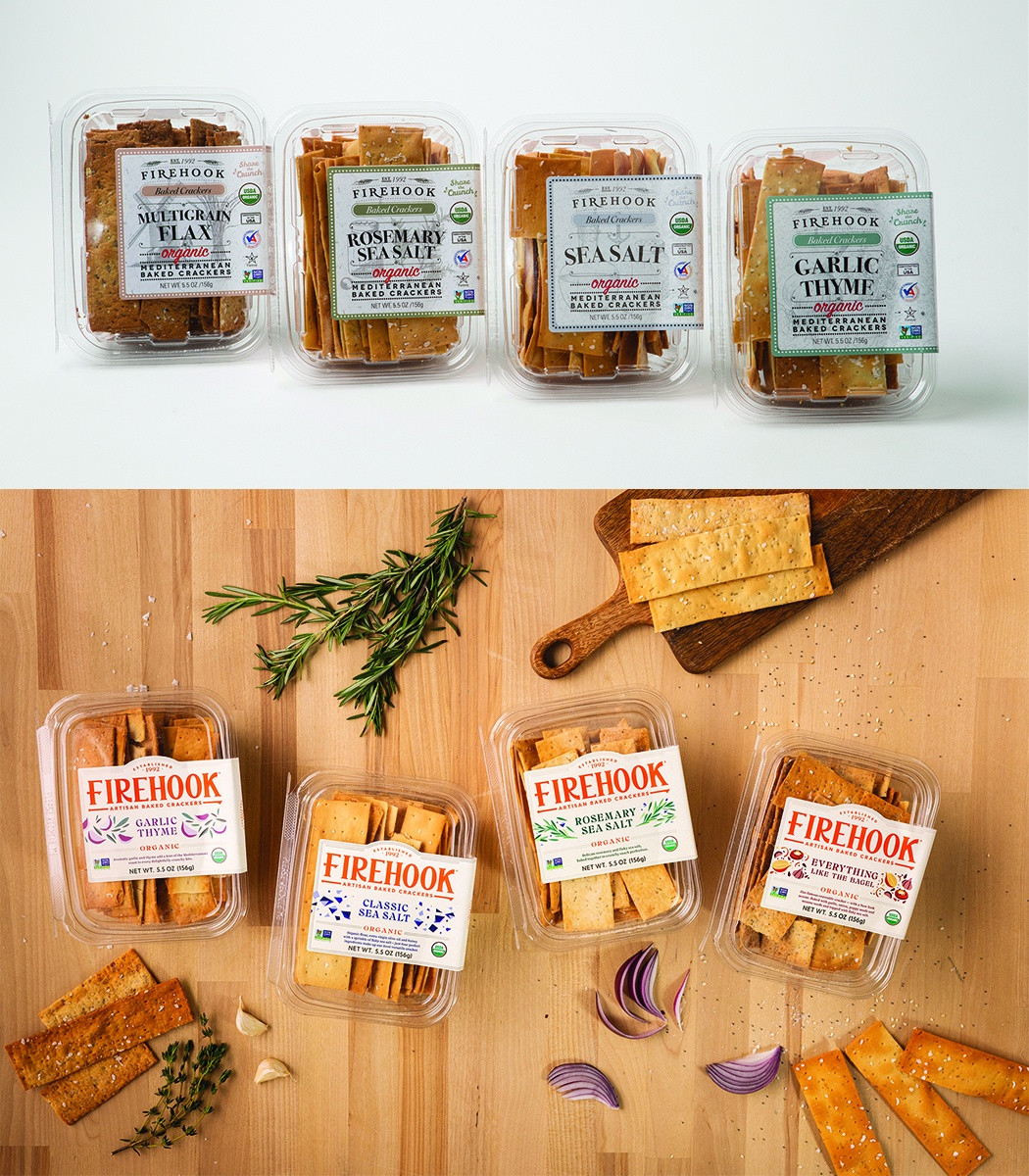
Firehook Crackers Packaging Redesign
Firehook Crackers' packaging redesign merges heritage with modernity, enhancing flavor appeal and brand connection.
Category
Package DesignCreative Credits
In the entrant's words
Firehook's packaging redesign introduces a vibrant new look across its portfolio, skillfully uniting the company's baking heritage with a modern, energetic feel. It is an opportunity to better connect the Firehook name with its unique product and packaging equities while celebrating the beauty and simplicity of its ingredients. The refreshed, signature orange logo uses a crisp, clean typeface and incorporates a stylized "fire hook" icon, an homage to the tools used by the earliest bakers. The transparent, resealable packaging continues to showcase the crackers' premium ingredients, with contemporary, hand-illustrated graphics prominently displayed on the front of each label. This redesign aims to heighten appetite appeal, clearly differentiate each flavor variety on the shelf and celebrate the craft and quality behind every cracker.
From the original award submission.
Own this work
ShareCite this page
Firehook Crackers. (2025). Firehook Crackers Packaging Redesign. GDUSA Design Gallery. https://gallery.gdusa.com/project/firehook-crackers-packaging-redesign
Design briefing
An AI-assisted expert read. Included with Pro ($19/mo).