Loading…
Own this work
ShareCite this page
Leibowitz. (2025). Lexington Partners Company Website. GDUSA Gallery. https://gallery.gdusa.com/project/lexington-partners-company-website
Design briefing
An AI-assisted expert read. Included with Pro ($19/mo).
Digital Design Awards Winner
Lexington Partners Company Website
Leibowitz revitalizes Lexington Partners' brand, emphasizing stability and quality through a sophisticated rebrand.
In the entrant's words
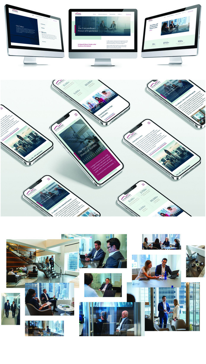
We helped set the tone for the latest chapter of Lexington’s decades-long history. Lexington Partners built its brand on consistent performance and industry reputation. Seeking to update the firm’s visual and editorial presence, their Investor Relations team turned to Leibowitz for a brand strategy and revitalization that would solidify Lexington’s competitive edge in a rapidly-evolving industry. During our competitive analysis, we found that Lexington’s longstanding history could serve as more than just a point of pride. A legacy is impressive, and Lexington’s is all the more striking because it was earned through decades of unwavering dedication to doing its best work for clients. In other words, Lexington’s success is inextricably linked to a remarkable combination of consistency and quality — one that very few other firms can lay claim to. This idea is at the heart of our rebrand, which took the mantra: “The extraordinary power of stability.” The messaging’s core philosophy emphasizes stability’s role in building Lexington’s impressive reputation: a secondary market focus since inception, reliability in delivering client successes, continuous reaching and raising the bar for performance. In less than a sentence, we highlight the rarity and transformative power of one of the world’s most impressive business-as-usuals. With the past as proof, Lexington can confidently speak to the future. The past-present-future connection defining Lexington’s new messaging applies just as well to its updated visual identity. The rebrand retains Lexington’s core elements, like the iconic maroon and wave motif, while introducing contemporary typography, imagery, and color. We coordinated photo and video shoots of Lexington’s team, knowing that bespoke, personalized images would further reinforce the new brand’s emphasis on Lexington’s team. The refreshed logo is more than an aesthetic improvement — the design was created to give the firm greater latitude to express the logo in multiple forms, optimized for various channels and execution parameters. Despite the scale of transformation, the new visual identity still “feels” like Lexington: sophisticated, innovative, and diligent. We owe that success to our understanding of Lexington’s “essence”: what it stands for, its relationship to audiences. Our design solutions are the “visual language” needed to tell this story. Drawing from the same essential truths as their messaging, the visuals work in tandem with content to establish a unified and impactful editorial presence.