Loading…

Digital Design Awards Winner
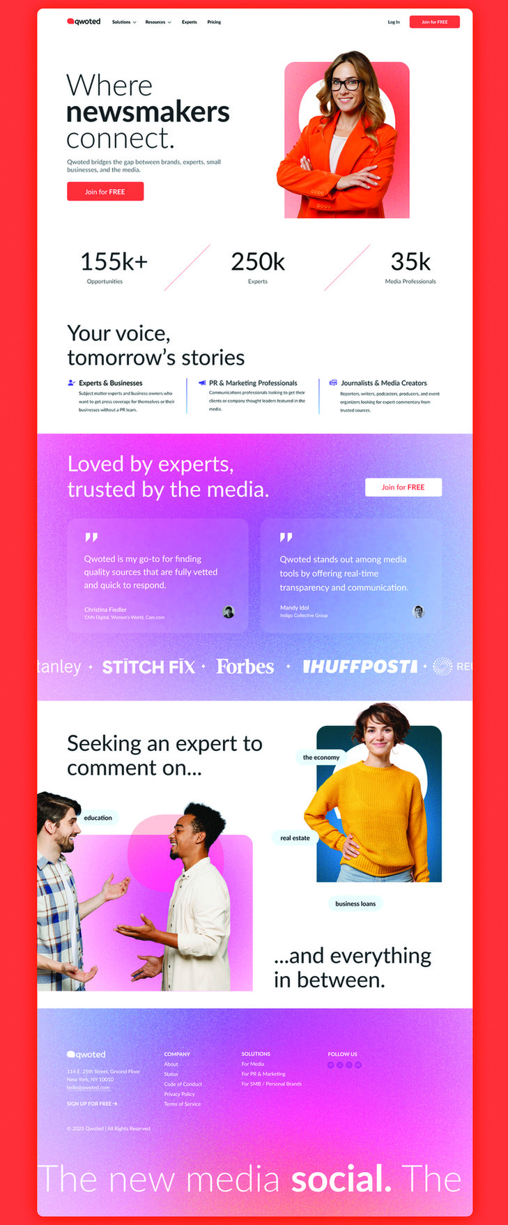
Qwoted Redesign
Qwoted's redesign uses bold colors and gradients to symbolize dynamic connections among newsmakers and experts.
Firm
Qwoted TeamCategory
Website & UX/UI DesignCreative Credits
In the entrant's words
Qwoted's new design language is a vibrant embodiment of our mission to be the premier platform where newsmakers, experts, and media outlets come together to share compelling stories. With the introduction of bold colors and dynamic gradients, the design not only captures attention but also represents the diverse voices and the energy of the community we foster. These elements are not just aesthetically pleasing; they are symbolic—each hue and transition signifies the seamless and dynamic connection between individuals on our platform. This fresh, contemporary brand language and communication truly reflect our dedication to facilitating rich, engaging conversations and collaborations, fostering an environment where every connection made is an opportunity for a story to unfold.
From the original award submission.
Own this work
ShareCite this page
Qwoted Team. (2025). Qwoted Redesign. GDUSA Design Gallery. https://gallery.gdusa.com/project/qwoted-redesign
Design briefing
An AI-assisted expert read. Included with Pro ($19/mo).